-
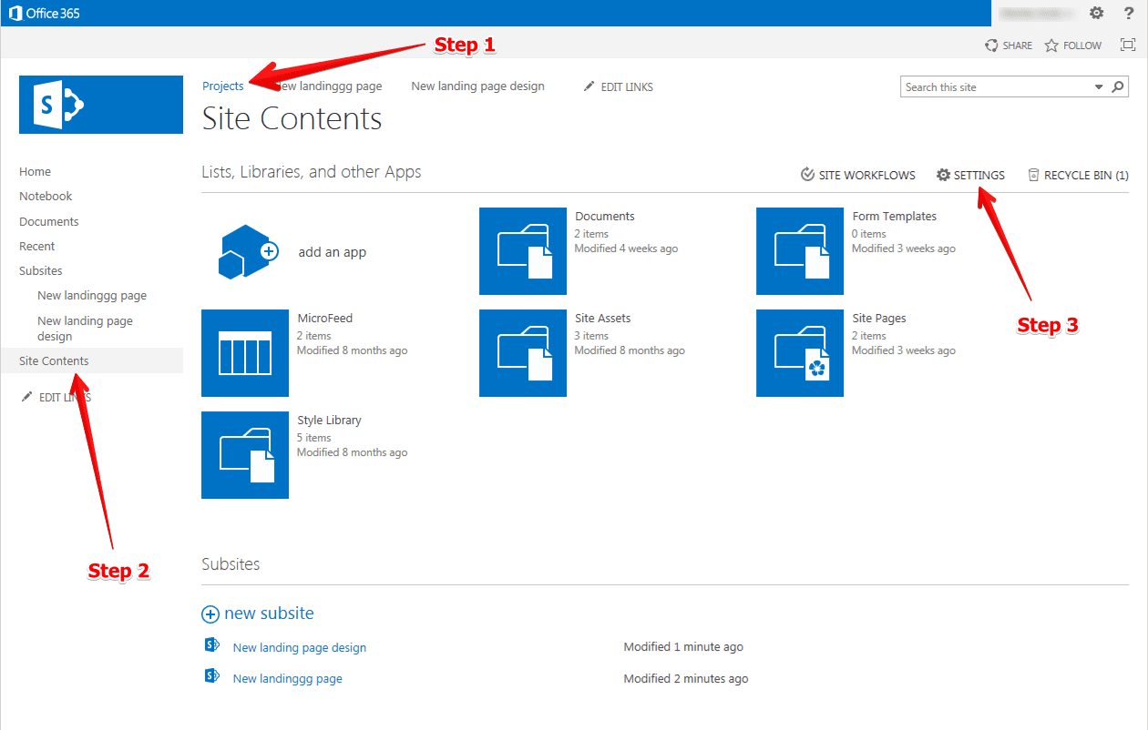
How to Delete a SharePoint Site
Deleting unused SharePoint sites helps keep your system organized. But sites contain lots of information, so deleting them permanently erases all that content. This guide explains how to delete sites carefully. Before You Delete Step-by-Step Deletion Process Recovery Options Deleted sites get sent to a Recycle Bin where they stay for a set time. If…
-
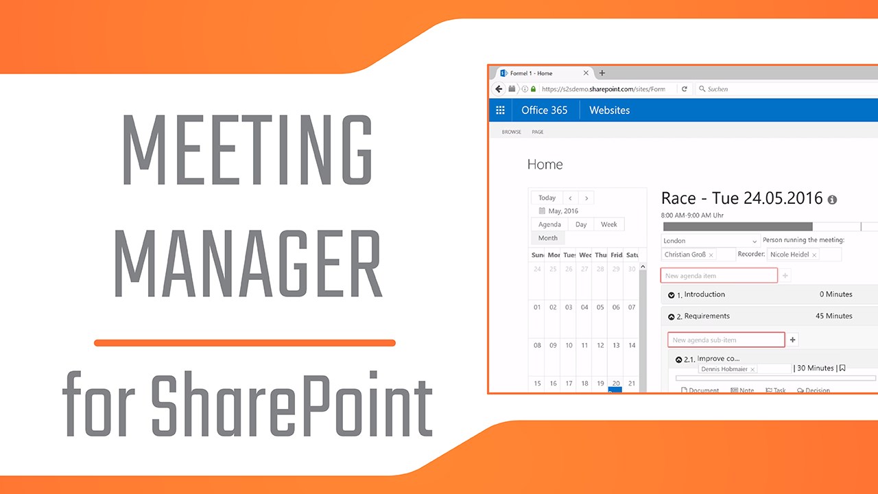
How to Build a Meeting Manager Tool in a Modern SharePoint Site
Creating a Meeting Manager Tool in SharePoint can streamline the process of organizing and managing meetings within your organization. This guide will walk you through the steps to build this tool using a modern SharePoint site, ensuring you have a central hub for scheduling, agenda sharing, and document management related to your meetings. Step 1:…
-

Sharepoint Jobs
SharePoint is a versatile platform widely used in various industries for collaboration, document management, and intranet sites. Due to its integration with Microsoft Office and dynamic capabilities, SharePoint supports a range of specialized roles. Each role requires different skills, education levels, and comes with its own set of responsibilities and salary expectations. 1. SharePoint Developer…
-
Integrating and Using React with Microsoft SharePoint
React is a robust JavaScript library, famous for building dynamic user interfaces. SharePoint is an effective collaborative platform, and one can deliver highly interactive SharePoint applications using React and HTML. This comprehensive guide will walk you through the process of setting up and using React within SharePoint. Step 1: Setting up SharePoint Framework (SPFx) Environment…
-
A Guide to Using CSS Sprites in SharePoint
Web technology continues to evolve in its quest to provide efficient ways to improve web pages’ load speed and user experience. One such ingenious method is the use of CSS Sprites. CSS Sprites amalgamate numerous images into one single image known as a sprite sheet. This guide aims to quantify using CSS sprites in SharePoint…
-
Everything About The Property Pane Portal in SharePoint
Microsoft SharePoint enables the seamless creation of innovative and highly dynamic websites for various business organizations. One of its most pivotal feature is the ‘Property Pane portal’. The Property Pane is an essential part of SharePoint in the SharePoint Framework (SPFx). This post will delve into its intricacies, discussing its introduction, features, customization possibilities, and…
-
A Progress Bar for Your Tasks List in SharePoint
Creating a visual representation of tasks in progress is a wonderful way to keep track of projects or duties. What’s more, it can help enhance the overall effectiveness of your team. If you’re using SharePoint, you can create a progress bar for your task list, allowing your colleagues to visualize completion status effectively. Here’s an…
-
A SharePoint Method to Display a List on Another Site
Sharing data across different sites on SharePoint is a crucial and commonly required functionality for businesses. One of the conventional ways is displaying a list from one site to another. Fortunately, this can be effortlessly achieved by utilizing SharePoint’s Web Part and Site Collection features. This step-by-step guide describes a detailed procedure on how to…
-
A Comprehensive Guide to Content Editor Web Part in SharePoint
The Content Editor Web Part is a notably versatile and powerful feature in SharePoint that should not be overlooked. This web part enables users to add formatted text, tables, hyperlinks, images, and even custom HTML to SharePoint sites. Whether you’re a seasoned SharePoint user or just getting started, leveraging the Content Editor can significantly enhance…
-
Color Coding Your SharePoint Calendar
Sharepoint calendars are an essential tool for practice in team collaborations, project planning, event tracking, and deadlines. One useful feature that can make these calendars extra efficient is color coding. Color coding allows you to assign different colors to different types of events, making it easier for users to differentiate and locate them in a…